As part of my Project Spectrum exploration of color, I will be chatting with different visual artists to get their perspective on color. My good friend Linda Jean Fisher was kind enough to respond to my questions about red. You can learn more about Linda Jean, including seeing images of her work, at her website.
Our interview, conducted via e-mail, reveals Linda Jean’s combination of serious academic approach and humor. When she discovers a focus for her inquiry, she explores it through language and visuals. Her current project is entitled Six Million. I have written about it here.
When I first saw your work in 1990 or 1991, you used mostly blacks, grays, and whites in your large paintings. I know you had used greater variety of color in earlier paintings. Why the shift to black and white?
I needed to find the voice of the work. It had gotten drowned out by my voice and I understood that if I limited my palette to Ivory Black and Titanium White, I would better understand the needs of the work versus my own wants.
What inspired you to begin your study of color?
I needed to take color apart and put it back together in order to better understand it.
What references would you suggest to others interested in a similar study?
Creative Color by Faber Birren
Color Perception in Art by Faber Birren
The New Munsell Student Color Set by Jim Long and Joy Turner Lake
Basic Color: An Interpretation of the Ostwald Color System by Egbert Jacobson
Bright Earth: The Invention of Colour by Philip Ball
Let’s talk about red, the May Project Spectrum color. What comes to mind when you think about red?
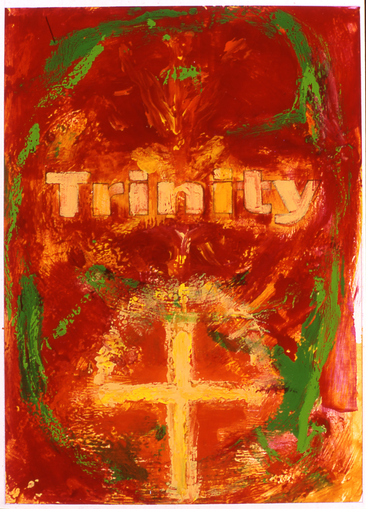
On 16 July 1945 the first atomic bomb was tested at 05:29:45 a.m. When I think of red, I think of Trinity. The following passage from Lansing Lamont’s book named Day of Trinity inspired a painting I made on 4 December 2003 simply titled “XIX [12-4-2003]” (Fig. 1):
Trinity. Its name evoked thoughts of Easter and visions of soaring cathedrals. It spoke of hymns, hushed vespers, children’s choirs and pealing anthems from invisible organs—all the legend, ritual and mystery of the Christian Church.
Was it blasphemy to christen with such a name the birthplace of the atomic bomb?
Perhaps. And yet there was a hint of holiness about the vast silent valley that was Trinity—something in its history that touched the indomitability of man’s questing spirit; something in its ageless and primitive beauty that suggested man’s earliest temples of prayer.
The 432-square-mile patch of desert that Trinity encompassed had known violence since the beginning of time. Cupped between two jagged mountain ranges, 150 miles from the southern border of New Mexico, it was part of the Jornada del Muerto—Journey of Death—the residue of centuries of volcanic fury dating from the pre-Cambrian era. Its thrusting peaks and massive lava flows testified to that. It was a place of deadening heat and drought, interspersed with fierce winds and thunderstorms.(Lamont 73)
 Figure 1: XIX [12-4-2003]
2003
Acrylic on 65 lb. acid-free cover paper
11” x 8.5”
You’re red-green colorblind. How does this affect your use of red in your work?
The fact that I am red-green colorblind makes me want to use red in works of art even more. Why? Because I don’t care that I don’t know what it looks like to other people. I find this feeling liberating because there was a time that what people thought about what I created mattered.
What has your favorite work featuring red been?

Figure 2: “XII [11-21-2003]”
Diagram of the Teller-Ulam Hydrogen Bomb
2003
Acrylic on 65 lb. acid-free cover paper
11” x 8.5”
One of the pieces by you that I proudly display in my home features 49 blocks of different variations of red. Can you describe the exploration you undertook through that piece?
Oh my, the forty-nine reds! I painted forty-nine blacks too. I love mixing colors. As a matter of fact, I believe that when I make paintings it is so that I have “a something” to put the colors that I mix on (e.g. paper, Plexiglas, etc.). I sometimes wonder—when the time comes that the voice of the work requires the use of paint—the works of art will be paint mixing performances. Hmmm?
What are your favorite red things?
My favorite red things are the hat featured in Titian’s “Portrait of a Man in a Red Cap” (Fig. 3), the nose on my stuffed Ernie (Fig. 4), and the sun, as it appears to me, on the eve of a very hot day.

Figure 3: Portrait of a Man in a Red Cap
c. 1516
Oil on canvas
32 3/8 x 28 in. (82.3 x 71.1 cm)
Frick Collection, New York

Figure 4: Ernie
My mother, Barbara, a fashion icon for me, has always contended “reds are hard to match.” In other words, she always discouraged me from purchasing red clothes and accessories because the shades of red can be wildly different and can even clash. While I respect Barbara’s opinion when it comes to fashion and style, this is one rule of hers that I rebel against. What do you think makes red a challenging color to use with other shades of red?
I think that what makes red a challenging color to wear with other shades of red, has to do with what I will define as the temperature of the red. For example: a scarf the color of a tomato, around the collar of a winter coat the color of a watermelon, just might raise a few eyebrows.
Is there anything else you’d like to say about the color red?
I will always remember the red rooftops decorating Italy’s landscape, just as I saw them from the sky above. I was on an airplane, not a magic carpet.
***
Thanks, Linda Jean, for taking the time to answer my questions!
I’m curious, readers, as we move away from red and into green for June: what are your favorite red or green objects? Feel free to leave a link to pictures in the comments! Even better, post on your blog, and leave a link to that!


You always have such a great approach to things and this take on Project Spectrum is no exception.